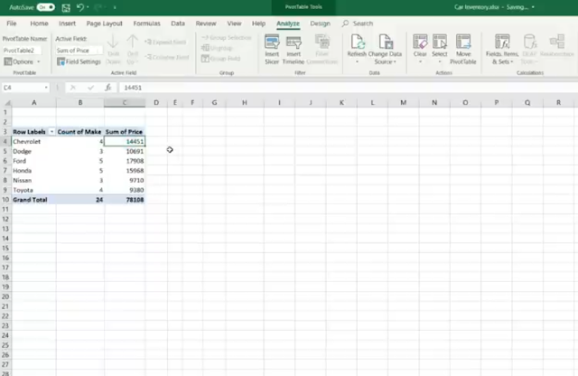
Mastering Pivot Tables in Microsoft Excel: A Comprehensive Guide
Pivot tables are powerful tools in Microsoft Excel that allow you to summarize and analyze large amounts of data with ease. Whether you’re a beginner or an experienced user, mastering pivot tables can significantly enhance your data analysis skills. In this comprehensive guide, we’ll cover everything you need to know about creating, customizing, and utilizing pivot tables effectively.
1. Understanding Pivot Tables
Before diving into the details, let’s grasp the basics. A pivot table is a dynamic summary report that enables you to rearrange and analyze data from different angles. It allows you to slice and dice your data, making it easier to identify trends, patterns, and outliers.
2. Preparing Your Data
To create a successful pivot table, start with clean and tabular data. Follow these best practices:
- Format as an Excel Table: Convert your data into an Excel Table (Ctrl + T). This ensures that your pivot table automatically adjusts when you add new rows or columns.
- Column Headers: Ensure each column has a unique, non-blank label as its header. Avoid double rows of headers or merged cells.
3. Building Your Pivot Table
Let’s create a pivot table step by step:
- Select Your Data: Highlight the data range you want to analyze.
- Insert a Pivot Table: Go to the Insert tab and click PivotTable. Choose where you want to place the pivot table.
- Design Your Pivot Table:
- Rows: Drag relevant fields to the Rows area.
- Columns: Place fields in the Columns area.
- Values: Add numeric data to the Values area (e.g., sum, average, count).
- Customize Your Pivot Table:
- Filters: Use filters to narrow down data.
- Calculated Fields: Create custom calculations.
- Grouping: Group dates or numeric values.
- Refresh Your Pivot Table: Whenever your data changes, refresh the pivot table to update the results
4. Advanced Techniques
Now let’s explore some advanced techniques:
- Slicers: Add slicers to filter data visually.
- Pivot Charts: Create charts directly from your pivot table.
- Calculated Items: Perform calculations within the pivot table.
- Timeline Filters: Analyze data over time.
7. Conditional Formatting in Pivot Tables
Conditional formatting allows you to highlight specific data points based on certain conditions. Here’s how to use it effectively:
- Color Scales: Apply color scales to visualize variations in data. For instance, you can shade cells from green to red based on the magnitude of values.
- Data Bars: Add data bars to show relative values within a column. Longer bars represent higher values.
- Icon Sets: Use icons (such as arrows or traffic lights) to indicate trends. For example, an upward arrow could signify positive growth.
8. Handling Blank Cells and Errors
Pivot tables often encounter missing data or errors. Address these issues:
- Dealing with Blanks: By default, Excel treats blank cells as zeros. You can change this behavior by right-clicking on a value cell, selecting “Value Field Settings,” and choosing an appropriate option (e.g., “Show items with no data”).
- Error Handling: If your data contains errors (like #DIV/0! or #N/A), handle them gracefully. You can replace errors with custom messages or leave them out of calculations.
9. Grouping Dates and Numeric Values
Grouping simplifies data analysis. Consider these grouping techniques:
- Date Grouping: Right-click on a date field in your pivot table, select “Group,” and choose the desired grouping (e.g., months, quarters, years).
- Numeric Grouping: Group numeric values (e.g., sales amounts) into ranges (e.g., $0-$100, $100-$200).
10. Refreshing Data Automatically
To keep your pivot table up-to-date, set it to refresh automatically:
- Go to the PivotTable Analyze tab.
- Click on Options.
- Under the Data section, select “Refresh automatically when opening the file.”
11. Leveraging Calculated Fields
Calculated fields allow you to create custom calculations within your pivot table. For instance:
- Calculate profit margins:
(Revenue - Cost) / Revenue - Compute growth rates:
(This Year's Sales - Last Year's Sales) / Last Year's Sales
12. Visualizing Pivot Table Results
Enhance your pivot table insights with charts and graphs:
- Column Charts: Compare data across categories.
- Line Charts: Show trends over time.
- Pie Charts: Display proportions.


0 Comments